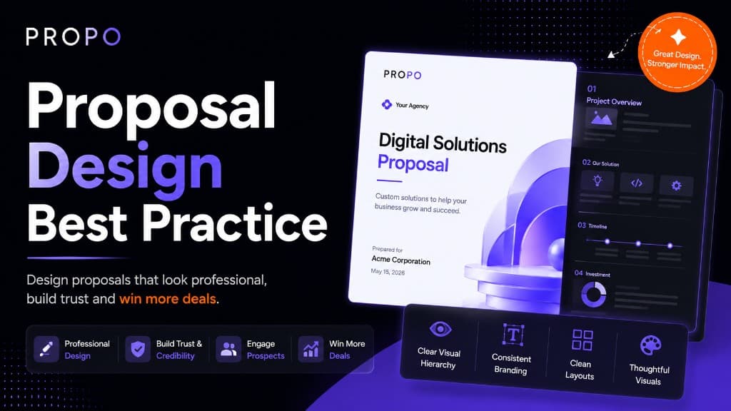
Proposal Design Best Practices That Actually Win Clients
Most proposals fail before the client reads a single word.
A cluttered layout, an inconsistent font, a wall of text with no visual breathing room: these things tell the client something about you before your credentials do. Design isn't decoration. In a proposal, it's communication. It signals whether you're organised, whether you care about details, and whether working with you will feel professional or chaotic.
The good news is that proposal design doesn't require a graphic designer or hours of layout work. It requires a clear set of principles applied consistently. This post covers what those principles are, what they look like in practice, and the mistakes that undermine otherwise strong proposals.
Start With Structure, Then Design
The most common proposal design mistake is thinking about visual style before thinking about structure.
A proposal that looks beautiful but buries the key information in the wrong order is still a bad proposal. Before you worry about fonts and colours, get the bones right.
A solid proposal structure for most agency engagements looks like this:
- Cover: Client name, project name, your agency name, date
- Executive summary: What you're proposing and why it's the right solution, in plain language
- Problem statement: What the client is trying to solve
- Proposed solution: What you're recommending and how it addresses the problem
- Scope of work: Specific deliverables, clearly listed
- Timeline: Phases, milestones, key dates
- Pricing: Itemised breakdown, total, payment terms
- About us / why us: Brief, relevant credentials
- Terms: Key conditions, revision policy, assumptions
- Approval: Signature or acceptance step
This order follows the client's natural reading logic: what's the context, what are you proposing, what will I get, what will it cost, and how do I say yes. Deviating from this, like opening with five pages about your agency before getting to the actual proposal, creates friction before the client has a reason to care.
Keep the Visual Hierarchy Clear
Visual hierarchy is the principle that the most important information should be the most visually prominent. Readers scan before they read, and good hierarchy guides that scan toward the things that matter most.
In a proposal, that means:
Section headings should be unmistakable. A client skimming your document should be able to identify every major section in under ten seconds. Use size, weight, or colour to make headings stand out clearly from body text.
Pricing should be easy to find. Clients always look for the number. If they have to hunt for it, that creates frustration. Put your pricing in a clean, clearly labelled table. Don't bury it in paragraph text.
Deliverables should be scannable. A bulleted or numbered list of deliverables is faster to process than the same information written as a paragraph. The client needs to be able to quickly check whether you've covered what they asked for.
Don't compete with yourself. If everything is bold, nothing is bold. Use emphasis selectively, for genuinely critical information, so that when something is highlighted, it means something.
Use White Space Deliberately
White space, the empty areas around and between elements, is one of the most underused design tools in proposals.
Agencies often feel the urge to fill space, as if a dense document signals more value. The opposite is true. Generous margins, spacing between sections, and breathing room around tables and lists make a document dramatically easier to read. They also make it look more premium.
Practically speaking:
- Don't stretch body text to full page width. A comfortable reading column is narrower than most people default to.
- Add visible spacing between sections, enough that the reader clearly knows they're moving from one topic to another.
- Don't crowd your pricing table. Padding inside table cells makes numbers easier to scan and errors easier to catch.
- Let your cover page breathe. A clean, minimal cover with just the essential information makes a stronger first impression than one crammed with logos, patterns, and introductory text.
Typography: Two Fonts, Used Consistently
Typography in proposals doesn't need to be complicated. In fact, complexity is the enemy.
A reliable approach: one font for headings, one font for body text. Both from the same family or with enough contrast to feel intentional. Applied consistently across every page.
Common mistakes:
Mixing too many fonts. Three or more fonts in one document rarely looks sophisticated. It looks unfinished. Pick two and commit.
Using decorative fonts for body text. Script and display fonts are hard to read at small sizes. Your body text should be clean, legible, and neutral. Save personality for headings if you want it at all.
Inconsistent font sizes. If your H2 headings are 16pt on page two and 14pt on page five, the document looks like it was assembled from separate pieces. Set a type scale at the start and stick to it.
Body text that's too small. Anything below 10pt is a strain to read, especially on screen. 11–12pt is comfortable for most readers in most contexts.
Colour: Brand Without Distraction
Your proposal should feel like it came from your agency, consistent with your website, your email signature, your other client-facing materials. That means using your brand colours, but using them with restraint.
A few principles that work well:
One primary accent colour. Use it for headings, section dividers, table headers, and key highlights. Not for body text, backgrounds, or decorative elements.
Neutral backgrounds.White or very light grey works for almost every professional context. Dark backgrounds can look striking in presentations but are harder to read in long-form documents and don't print well.
Avoid red for anything that isn't a warning. Red draws attention to problems. Using it for section headings or decorative elements creates unintended anxiety, not the feeling you want a client to associate with your proposal.
Check contrast.Light grey text on a white background might look elegant on a high-contrast monitor and be nearly unreadable on a standard laptop screen. If the text isn't easy to read, the design has failed regardless of how refined it looks.
The Cover Page Sets the Tone
The cover page is the first thing the client sees. It's worth getting right.
A strong proposal cover includes: the client's company name (ideally personalised, not generic), the project name or type, your agency name and logo, and the date. That's it.
What it doesn't need: a stock photo that has nothing to do with the project, a long tagline, a list of your services, or decorative patterns that compete with the content.
Personalisation matters more than decoration. A cover page that says the client's company name in the headline tells them immediately that this proposal was written for them, not copied from a template and slightly adjusted. That small signal builds trust before they read a word.
Proposals Are Read on Screens, Not Printers
This sounds obvious in 2026, but a lot of proposal templates are still designed with print in mind: A4 layouts, narrow margins, small text optimised for paper.
The client is almost certainly reading your proposal on a laptop, a tablet, or a phone. That changes some design decisions:
Readable on a 13-inch laptop screen. Text that looks fine at full zoom on a large monitor may be too small on a standard laptop. Test your proposals at 100% zoom on a mid-range screen before sending.
Mobile-readable if possible.If you're using a PDF, test how it looks on a phone. If your pricing table requires horizontal scrolling or the text is unreadable without zooming, the proposal is not working on mobile. More clients are reading documents on their phones than most agencies account for.
Links should work. If your proposal references your portfolio, a case study, or your website, those links should be clickable. A client reading your proposal on a screen should be able to visit those pages without copying and pasting a URL.
Consistency Is the Foundation
All the principles above (hierarchy, white space, typography, colour) depend on one underlying thing: consistency.
A proposal that uses two different table styles, three different heading formats, and body text that shifts between justified and left-aligned on different pages looks like it was assembled in a hurry. Even if each individual element is well-designed, inconsistency creates a feeling of carelessness.
Consistency is also what makes proposals faster to produce over time. When you have a clear template (defined styles for every element, a fixed colour palette, a set structure), producing a new proposal means filling in the content, not re-making design decisions from scratch every time.
A good proposal tool handles this automatically. Propo applies your branding (logo, colours, fonts) consistently across every section and every export. The structure is built in. The formatting is handled. You focus on the content that's specific to this client and this project.
Checklist Before You Send
Before any proposal goes out, run through these quickly:
- Client's name is spelled correctly (and appears on the cover)
- All placeholder text has been replaced
- Pricing figures are correct and match the line items
- Timeline dates are realistic and internally consistent
- Every section is present and complete
- Document looks clean on a laptop screen at 100% zoom
- Document is readable on mobile
- Approval step is clear: the client knows what to do to say yes
- Your contact details are easy to find
A proposal with a typo in the client's company name, or a pricing table that still says "INSERT RATE HERE," has cost more than a few agencies a deal they should have won.
Design as a Sales Tool
Proposal design isn't about making something look nice. It's about making it easy for the client to understand what you're offering, feel confident that you'll deliver it, and take the step of saying yes.
Every design decision (the structure, the hierarchy, the typography, the use of white space) should serve that goal. When design is working, the client barely notices it. They just find the document easy to read, easy to navigate, and easy to act on.
That's the standard worth designing to.
Read next: How Agencies Can Close Clients Faster
Win More Clients with Better Proposals
Create professional proposals for Fiverr, Upwork, and direct clients in minutes using AI-powered generation and premium templates.
Keep reading
Similar guides
More on proposals, pricing, and winning clients, picked for this topic.
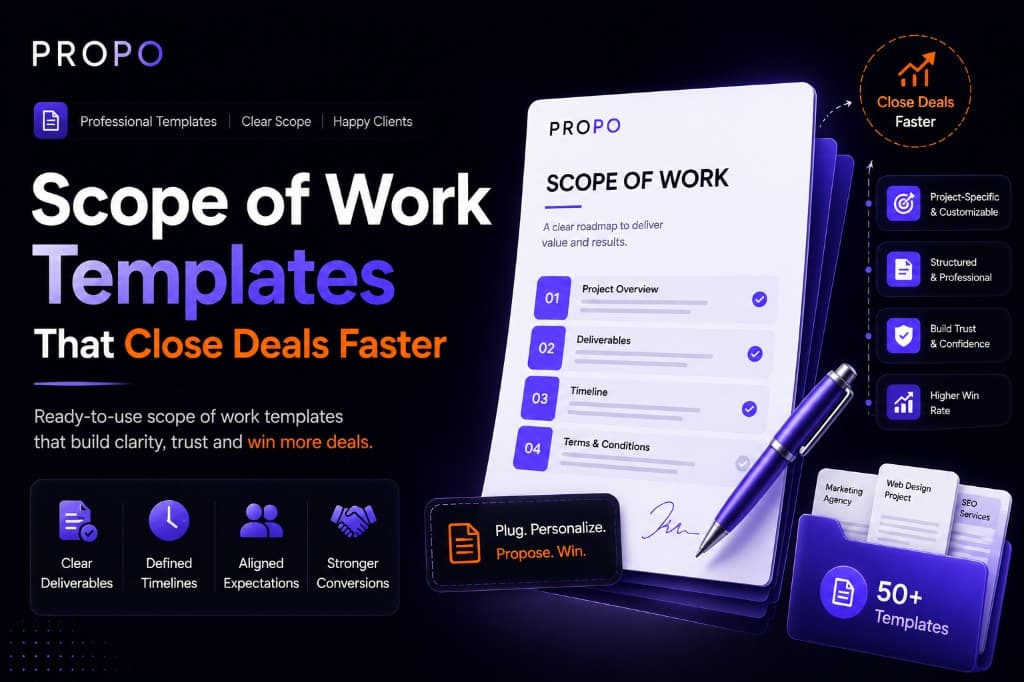
Scope of Work Templates That Close Deals Faster
Use a repeatable scope of work structure to reduce scope creep, set client expectations, and move from proposal to signed project quickly.
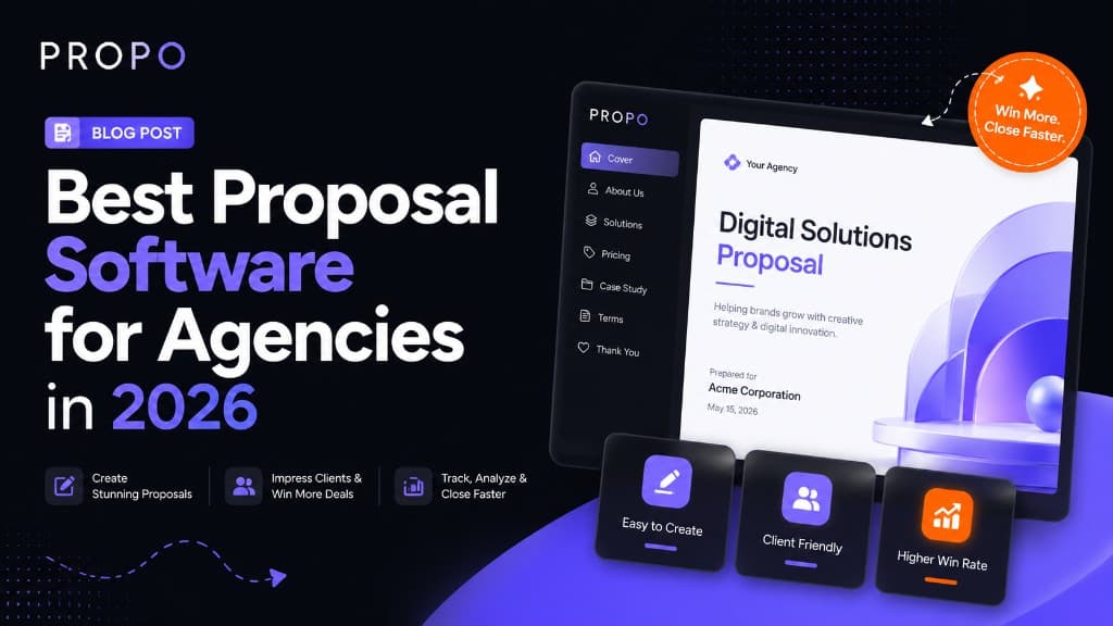
Best Proposal Software for Agencies in 2026
What to look for in agency proposal software—from interactive formats and branding to pricing tables and approval workflows that help studios close more retainers.